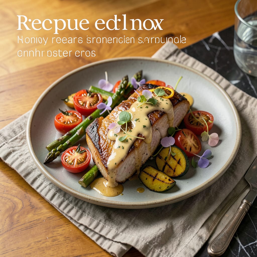
A recipe graphic is a visually designed layout that presents cooking instructions, ingredients, and measurements in an easy-to-follow format. It combines typography, icons, and illustrations to enhance clarity and engagement, often used for blogs, social media, or printable recipe cards.
I think of these as the visual blueprints for cooking success—they transform basic text recipes into eye-catching guides that actually make people want to cook. 🔥 The magic happens when you strategically pair bold typography with intuitive icons (like a knife for chopping or a timer for baking), creating a seamless experience from grocery list to final dish. What sets the best ones apart is their ability to simplify complex steps while maintaining brand personality—whether that’s rustic charm for a farmhouse blog or sleek minimalism for a modern foodie audience.
From my experience, the most effective designs anticipate the cook’s needs by highlighting critical measurements and time-sensitive steps at a glance. ✨ This isn’t just about pretty pictures—it’s about reducing kitchen stress by making information instantly accessible, even with flour-covered hands. The rise of Pinterest and Instagram Stories has made these graphics essential tools for food creators looking to stand out in crowded digital spaces.
💡 In This Article
- Key Elements of an Effective Recipe Graphic Design
- Tools and Software for Creating Stunning Recipe Graphics
Key Elements of an Effective Recipe Graphic Design
The secret to a high-impact recipe graphic lies in its visual hierarchy. Your eyes should naturally flow from the dish name (largest font, 36-48pt) to ingredients (medium weight, 18-24pt) before landing on step-by-step instructions (smallest but clear, 14-16pt). This intentional sizing creates a subconscious roadmap for cooks.
🔥 I’ve found that adding 10-15% white space between sections prevents visual overload while keeping everything scannable.
Color psychology plays a huge role in appetite appeal. Warm tones like #FF6B35 (coral) or #D4A017 (golden yellow) stimulate hunger, while cool blues (#0277BD) work better for clean, modern designs. The contrast ratio between text and background should hit at least 4.5:1 for readability—test this using free tools like WebAIM’s contrast checker.
Icons should use a consistent style (flat, outline, or 3D) and maintain 1.5x the size of body text to stand out without overwhelming.
Typography choices make or break the design’s personality. A study by Adobe found that 73% of readers judge content credibility based on font selection. For recipe graphics, I recommend pairing a bold sans-serif (like Montserrat Bold) for headings with a clean serif (such as Lora Regular) for body text.
This combination balances modern clarity with approachable warmth. 💫 The line height should sit at 1.4-1.6x the font size to prevent text from feeling cramped.
The layout should mirror the cooking process’s natural flow. Place ingredients in a vertical column on the left (where Western readers start scanning) and instructions in a numbered list on the right. Critical timing notes (“marinate 2 hours”) deserve highlight boxes in your accent color.
For social media, square dimensions (1080x1080px) work best, while printable versions need 300DPI resolution and bleed margins. ✨
Brand consistency builds recognition. Use the same 3-4 colors, 2 fonts max, and icon style across all recipes. This creates instant familiarity—readers will recognize your content in crowded Pinterest feeds. For food bloggers, adding a subtle watermark (5-10% opacity) protects your work while keeping the design clean.
The most successful creators treat their recipe graphics like product packaging: instantly identifiable and trustworthy.
Accessibility matters more than you think. 1 in 12 men have color vision deficiency, so avoid red-green contrasts for critical info. Alt text for icons (“chopping knife graphic”) helps screen readers.
🌟 Testing your design at 50% size on mobile ensures it remains legible on small screens—where 68% of recipe searches now happen according to Google’s 2023 food trends report.
Remember that the best recipe graphics anticipate mistakes before they happen. Highlight common pitfalls (“don’t overmix batter”) in warning boxes, use checkmarks for completed steps in interactive PDFs, and include a tiny preview image of the finished dish (no larger than 15% of total graphic) to maintain focus on the instructions.
These small details transform good designs into indispensable kitchen tools.

- BBQ Sausage Recipe Oven: Smoky Depth Without the Grill - September 28, 2026
- BBQ Chicken Bowl Recipe Rice: Smoky Sweetness Over Fluffy Grains - September 28, 2026
- Beef Cutlet Recipe Ideas: Crispy Breaded Patties With Bold Seasonings - September 28, 2026