
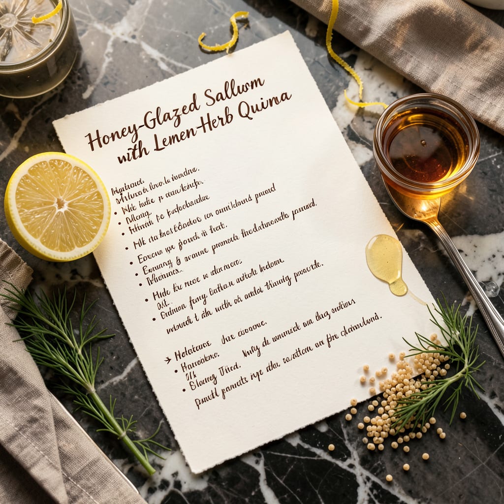
A standout recipe card image combines clear typography, high-quality food photography, and a balanced layout. Use contrasting colors for readability, keep essential details prominent, and ensure the design reflects the dish’s personality while remaining functional for home cooks.
Great recipe card visuals do more than just look pretty—they guide the cook through the process. 💫 I focus on hierarchy first: bold headings for the dish name, high-contrast text for cooking times/temps, and whitespace to prevent clutter. The photography should showcase the dish’s best angle while keeping ingredients recognizable. What separates good designs from great ones is testing readability at different sizes—what works on a phone screen might fail when printed.
Think of your card as a mini cooking instructor. The colors should complement the food (warm tones for baked goods, cool tones for salads) while ensuring text pops. I always include a visual anchor—like a distinctive border or icon—that ties to the recipe’s theme. Remember, the goal isn’t just to impress—it’s to make the cooking process smoother for whoever uses it. ✨
💡 In This Article
- Key Design Principles for Eye-Catching Recipe Cards
- Tools and Templates to Create Professional Recipe Card Images
Key Design Principles for Eye-Catching Recipe Cards
The magic starts with typography hierarchy—your dish name should command attention with bold, large fonts (think 36-48pt for digital), while cooking times and temperatures use medium-weight text (18-24pt). Serif fonts like Playfair Display add elegance to baked goods, while clean sans-serifs like Montserrat work for modern dishes. The secret?
Limit to 2-3 font styles max to avoid visual chaos. 🔥
Color psychology plays a huge role in appetite appeal. Warm hues (#FF6B35 oranges, #D32F2F reds) stimulate hunger for hearty meals, while cool tones (#388E3C greens, #1976D2 blues) suit fresh salads. Always test contrast ratios—black text on white has 21:1 contrast (ideal), while yellow on white fails with 1.07:1.
Pro tip: Use 60-30-10 color rule (dominant, secondary, accent) for balance. ✨
Food photography follows the “rule of thirds”—place your dish’s focal point where grid lines intersect. Overhead shots work for flat lays (cookies, tacos), while 45° angles add depth to soups or casseroles. Lighting matters: 5000K-6500K color temperature keeps food looking natural, not yellowed.
Always include a “hero ingredient” in focus—like fresh herbs on pasta—to anchor the composition. 💫
Functionality trumps aesthetics when it comes to layout. Essential details (servings, prep time, oven temp) need dedicated zones with 12pt+ text. Leave 0.5″ margins for printable versions to prevent cropping. Digital cards should load under 2MB—compress images at 72dpi for web, 300dpi for print.
The best designs pass the “3-second test”: can someone glance and identify the dish, cooking method, and key details? ⚡
Texture layers create visual interest without clutter. Try these combinations:
- Matte backgrounds with glossy food photos (think chalkboard + shiny chocolate)
- Subtle patterns (10% opacity) behind text blocks for depth
- Hand-drawn elements (fork icons, underlines) to soften digital precision
Accessibility isn’t optional—18% of people have some visual impairment. Use tools like WebAIM Contrast Checker to verify text readability. For colorblind users, avoid red-green combos; blue-orange pairs work better. Always provide alt text for images describing the dish and key visual elements. 🌟
Remember: A great recipe card works like a visual recipe. The photography shows the goal, the typography guides the steps, and the layout ensures nothing gets lost in translation from screen to kitchen. Test your design by printing at 80% scale—if it’s still clear, you’ve nailed it. 💛

- BBQ Sausage Recipe Oven: Smoky Depth Without the Grill - September 28, 2026
- BBQ Chicken Bowl Recipe Rice: Smoky Sweetness Over Fluffy Grains - September 28, 2026
- Beef Cutlet Recipe Ideas: Crispy Breaded Patties With Bold Seasonings - September 28, 2026