
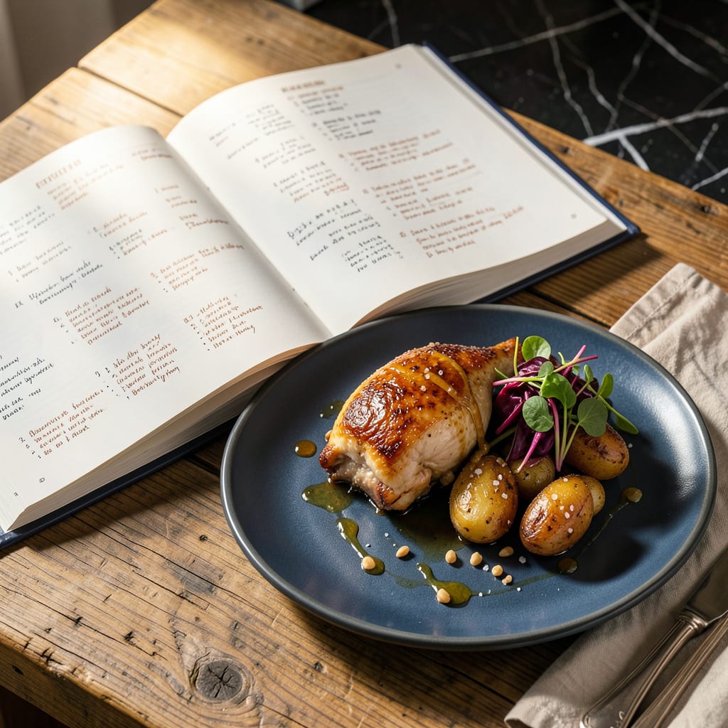
High-quality recipe book images feature crisp food photography, clean typography, and cohesive color schemes. They balance visual appeal with readability, often using natural lighting and minimalist layouts to highlight dishes while maintaining a professional, inviting aesthetic.
What sets exceptional recipe imagery apart is its ability to evoke emotion while serving a functional purpose. 🔥 I’ve noticed that the most effective designs use strategic negative space to prevent visual clutter, allowing the food to remain the undisputed star. The typography choices often reflect the book’s personality—whether it’s elegant serif fonts for classic cuisine or bold sans-serif for modern cooking. What’s fascinating is how color temperature plays with appetite stimulation: warm tones like golden browns and rich reds naturally make dishes appear more appetizing than cool blues or grays.
💡 In This Article
- Key Elements of Professional Recipe Book Photography
- Where to Find and How to Use Recipe Book Images Legally
Key Elements of Professional Recipe Book Photography
The magic starts with lighting—specifically diffused natural light at a 45-degree angle, which creates soft shadows that give food dimension. Professional food photographers often use a 5-in-1 reflector to bounce light onto shadowed areas, reducing harsh contrasts.
The golden hours (first two hours after sunrise, last two before sunset) provide the most flattering light, with a color temperature around 5,000-5,500K, which enhances food’s natural colors without artificial tinting. 🔥
Composition follows the rule of thirds, where key elements (main dish, garnish, utensils) align along gridlines or intersections. Negative space isn’t empty—it’s strategically placed to guide the viewer’s eye. For example, a drizzle of sauce might lead from the corner to the plate’s center.
Props are carefully selected: wooden cutting boards add warmth, while marble surfaces suggest elegance. The color wheel is crucial—complementary colors (like green herbs on red tomatoes) create visual pop, while analogous schemes (oranges, yellows, creams) feel harmonious. ✨
Food styling tricks make dishes camera-ready. A spray of water-glycerin mix (1:1 ratio) keeps salads looking fresh for hours. Meat gets brushed with oil to enhance sheen, and ice cream is often substituted with mashed potatoes for shots that need to last.
The “hero angle” (typically 3/4 view) shows depth and texture, while overhead shots work for flat lays. What’s fascinating is how odd numbers (3 berries, 5 cookies) create more dynamic compositions than even groupings.
Typography and layout maintain consistency across pages. Recipe titles often use bold sans-serif fonts (like Futura or Helvetica) at 18-24pt for readability, while ingredient lists use lighter weights. The golden ratio (1:1.618) guides page proportions—text blocks relate to image sizes in this pleasing mathematical relationship.
Color schemes stay within 3-4 primary hues, with one accent color (like your brand’s #ffcc00) used sparingly for highlights. 💫
Psychology plays a huge role in appetite appeal. Studies show red and yellow increase hunger (think fast food logos), while blue suppresses it. Warm lighting (2,700-3,500K) makes food appear more inviting than cool tones. The “steam effect” isn’t always real—it’s often added in post-production using Photoshop’s blur filters.
Even plate colors matter: white makes food look more vibrant, while dark plates create drama but can make portions appear smaller.
Consistency across pages creates visual rhythm. The same 1-inch margin around images, identical font pairings, and recurring design elements (like a small icon for cooking times) help readers navigate intuitively. A professional recipe book might use 3-4 template layouts that vary slightly but maintain core design principles.
This repetition builds brand recognition—readers start associating your specific style with quality content. 🌟
The best recipe images tell a story. A crumb on the plate suggests recent activity; a hand reaching for food implies shareability. The background might hint at the meal’s origin—a rustic table for Italian dishes, sleek marble for modern cuisine. Even the depth of field (f/2.8-f/5.6 typically) focuses attention while keeping context.
What separates good from great is when every element serves both aesthetic and functional purposes simultaneously. ⚡

- BBQ Sausage Recipe Oven: Smoky Depth Without the Grill - September 28, 2026
- BBQ Chicken Bowl Recipe Rice: Smoky Sweetness Over Fluffy Grains - September 28, 2026
- Beef Cutlet Recipe Ideas: Crispy Breaded Patties With Bold Seasonings - September 28, 2026