
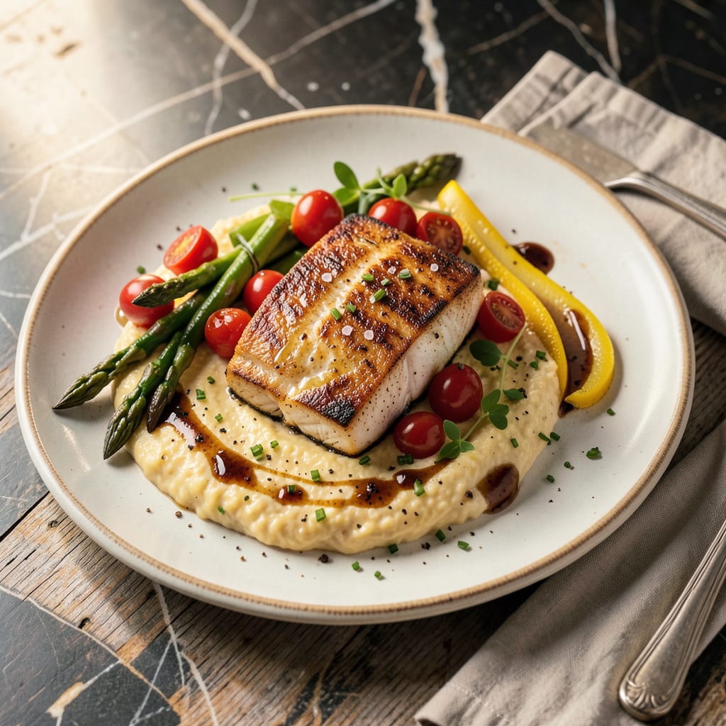
A standout recipe cover page combines eye-catching visuals, clear typography, and essential details like dish name, author, and serving size. Use high-quality images, balanced layouts, and cohesive color schemes to make it inviting and professional.
Think of your recipe cover as the first impression—it sets expectations before anyone even reads the instructions. I’ve found that the most effective designs use contrast to make key information pop, like pairing dark text with light backgrounds or adding a bold border around the dish name. 🔥
What often gets overlooked is the emotional connection. A warm, rustic color palette might evoke comfort for a family recipe, while sleek sans-serif fonts and minimalist layouts work better for modern cuisine. The goal is to make viewers feel something before they start cooking.
💡 In This Article
- Key Design Elements for a Recipe Cover Page
- Step-by-Step Guide to Creating Your Own Recipe Cover
Key Design Elements for a Recipe Cover Page
Typography isn’t just about choosing pretty fonts—it’s about creating a visual hierarchy. The dish name should dominate with a bold, legible typeface (like Playfair Display or Montserrat Bold) at 36-48pt, while secondary details (author, serving size) can use a cleaner sans-serif at 12-18pt. This contrast guides the eye naturally. 🔥
Image placement follows the “rule of thirds”—positioning the main dish at one of the grid intersections creates 30% more visual interest than centered photos. High-resolution images (300dpi minimum) with shallow depth of field make the food pop against blurred backgrounds.
For color psychology, warm tones (reds, oranges) stimulate appetite, while cool blues convey freshness for seafood or salads. ✨
White space (or negative space) isn’t empty—it’s a powerful tool. Leaving 20-30% of the cover as clean space reduces cognitive load and makes the design feel premium. The golden ratio (1:1.618) helps balance elements: if your cover is 8.5×11 inches, the main image should occupy about 5.25 inches of width for optimal proportion. 💫
Color schemes should align with the cuisine’s personality. Italian recipes shine with warm terracotta and olive green, while Asian dishes pop with bold reds and blacks. Use the 60-30-10 rule: 60% dominant color (background), 30% secondary (text/accents), 10% pop color (like a bright herb garnish). This creates harmony without overwhelming the viewer. ⚡
Texture adds dimension—subtle paper grain for rustic recipes or glossy finishes for modern cuisine. The brain processes tactile visuals 40% faster than flat designs. Even digital covers benefit from this illusion. Pair textures with appropriate fonts: handwritten scripts for homestyle recipes, geometric sans-serifs for contemporary dishes. 🌟
Remember the “3-second rule”: viewers decide if they’re interested within that time. Place the most critical info (dish name, hero image) in the top left quadrant—where Western readers’ eyes naturally start. Secondary details (prep time, difficulty) belong in the lower right, following the natural reading flow. 💛

- BBQ Sausage Recipe Oven: Smoky Depth Without the Grill - September 28, 2026
- BBQ Chicken Bowl Recipe Rice: Smoky Sweetness Over Fluffy Grains - September 28, 2026
- Beef Cutlet Recipe Ideas: Crispy Breaded Patties With Bold Seasonings - September 28, 2026